Not entirely sure what project this research is for yet, but Dave told us to research funky and modern branding / packaging, so here is some research, and its pretty funky!
^Liquid-y form; colours are all shades of red associated with coke; white text stands out; shapes flow; typography is same as always; rounded edges; gender neutral design.
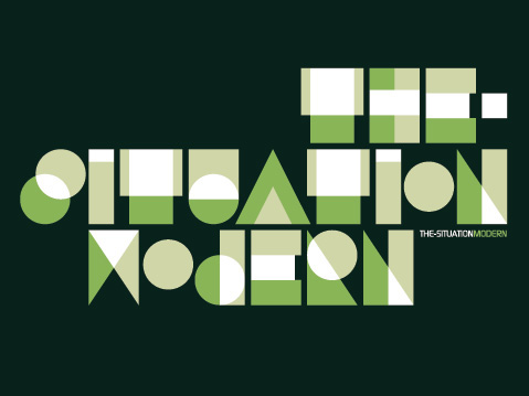
^Very sharp; geometric shapes / typography; green theme, just different shades of green (and white, obviously); not very easily readable, but a good concept; definitely modern and maybe even futuristic; all made from shapes- circles, squares, rectangles, triangles; overlap of colour in the shapes is effective; gender neutral design.
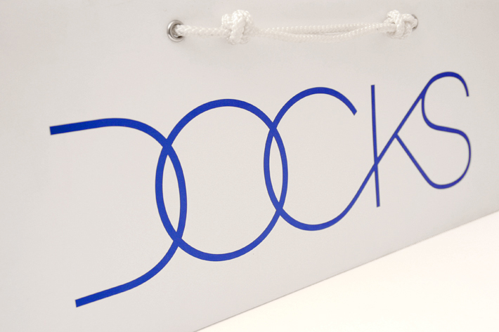
^modern; text flows; simple and sleek typography; assuming target audience would be teens to young people; curved lettering; gender neutral design.
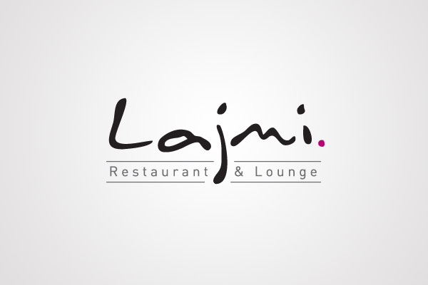
^soft typography, handwritten style; fairly gender neutral, however swaying more towards feminine; text flows; simple colour scheme and text stands out; I'd guess that target market would be middle aged couples, directed towards the women more so.

^gender neutral; simple and sharp typography; image is slightly abract, though you can still tell what it is, with the help of the text; simple colour scheme; the grey is softer than black would have been, grey compliments other two colours better.

^sleek, sharp, simple design; gender neutral; I'd say target audience is children (though designs would obviously have to engage the parents too); imagery is simple, block colours; designs are quite plain, one image, brand name, few details at the bottom; images are easily recognisable as the fruit they are; consistant designs; colour scheme relates to flavour; navy blue/purple colour is consistant throughout designs and is complimentary of all other colours; typography is simple, rounded and also a slightly childish font.

^feminine design; target audience young to middle aged women; consistant design throughout; abstract imagery; each design has a different image and name; sleek and simple designs, not too much going on; image and text on boxes matches what's on the bottles

^very simple design, very plain; easy to read typography, flows, simple; only two colours that compliment each other, white standout against the purple; I'd guess the target audience would be middle aged to older women; feminine design; simple and sharp design, gets the point across.

^shape and form of the product is sleek and simple, very smooth; typography is easy to read, clear, sharp; text stands out from the bottles due to the liquid colour (apart from the white one...); target market would be young people, 18-30 maybe, as they'd have to be old enough to drink; very simple designs, not too much going on, really modern- I really like these and providing they tasted nice I'd definitely drink them!

^these strike me as designs for some kind of computer programme? That was my first thought anyway; sleek and bright, very eye catching with all the colours; curved corners on the shapes; quite gender neutral designs, however women would probably be more taken with the multi-coloured designs; target audience would probably be young to middle aged professionals.
No comments:
Post a Comment