Wednesday 29 October 2014

The Harley Gallery, Worksop

So we went on a trip to The Harley Gallery the other week with college, and here's a few pictures that I took! The first two are collages that I created, I prefer the second one! And the third photo is of a pot that one of the artists that has a studio there makes. These specific pots intrigued me because she explained that they were made from £5, £10 and £20 notes! The notes that have been taken out of service are shredded so that they cannot possibly be put back together. The artist (I unfortunately con't remember her name and I didn't even pick up a card!) makes pots and cutlery, that kind of thing, and she uses paper mache as the technique! The stuff was really cool, especially the money pots! I could see the little flecks of silver and the colours from the notes in the pots once she had pointed out that they were made from money, I'd love to have bought one..but didn't have any money on me :(

Friday 24 October 2014

Funky packaging

 
^sleek; complex design; obvious what it is; consistancy; colour schemes relate to flavours; target market probably young to middle aged people, possibly broader than that; gender neutral designs; typography is simple, clear, not too bold.
 
^really funky, artistic; a lot going on, but you can still clearly see the typography; aimed at young to middle aged people, 18-30 ish; bright colours.
 
^the bottle represents the product itself; simple colour scheme so doesn't detract from the design; typography is quite fancy, but clear to read; target market probably young to middle age, fairly gender neutral but possibly more masculine than feminine.
 
^target audience is children, but has to appeal to parents as well (because they're the ones buying the products for their kids!); packaging represents what the product is, orange juice looks like an orange; consistant throughout designs; minimal text needed; because of unusual shapes they are specially designed with sharp edges so the will stand up; slick, sharp, simple designs- thinking outside of the box!
 
^colours and shape (leaf) to represent nature --> natural beauty, positive view of self; aimed at women aged between 16-25 (give or take a few years); sleek, shiny, simple design.
 
^sleek shape and form; consistant designs; smooth, strange, curvy shapes; block colours; overlap of colours is cool; target market young people, 18-25 ish; aimed more at females suggested by colours.
 
^great idea to reuse egg cartons; theme and colour scheme relate; consistant designs; target audience would be mums with young children; the product is fairly gender neutral so that boys and girls could wear the socks, but there's a cutesy femininity to the designs to grab the attention of mums; typography is cute and childish, to match the brand identity, but clear and bold.
 
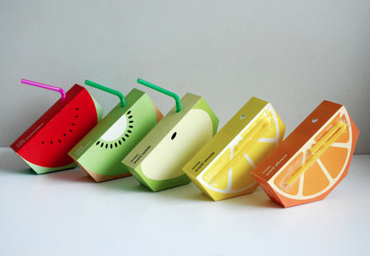
^minimal text; cartons appear to be made of the skins of the fruit juice they contain; I can imagine they're textured cartons?; consistant shape and form; target market would be children, but to appeal to mums; gender neutral for children; very simple design, maybe a tad too plain, there doesn't appear to be any information about the contents of the cartons.
 
^very clever branding- notice the way two cans put together sneakily represent a woman's bottom half in underwear..subliminal messaging?; text is small and not clear in the picture, but possibly clearer in reality; target market is probably young to middle aged men, due to the subliminal message; masculine design; simple colour scheme, not too bold but interesting image on the cans- from a distance you wouldn't be able to see what it is so would require further inspection and probably handling the can ---> likelihood to buy increases!
 
^really weird design...but cool all the same; old fashioned style typography; simple design; not clear what the product is, but is intruiging; target audience would be people with a sense of humour, probably young males; the design is fairly male orientated I'd say, due to the man's chest on the front, and it's not a cute or feminine design.
 
^target market is children and parents; I'd say it's a more masculine design due to the sharks; consistant despite the sharks being different colours and having different expressions; typography is bold and clear; simple designs; colour schemes are bright and eye catching.
 
^very modern and futuristic looking; sleek shape and form; matte metal with minimal detail; type style and colours are widely recognised and associated with coca-cola brand; typography is bold and stands out; colours all compliment each other; consistancy throughout designs;
details are kept on back of bottles so not to detract from the eye catching new designs; target market is pretty much anyone and everyone- however more young to middle age than children and the elderly; gender neutral designs.
 
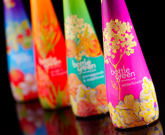
^feminine design; target audience probably middle aged women; consistant designs; bright colours compliment each other; typography stands out from the images; shape and form of bottles is sleek, simple; very decorative designs.

little bit of primary research!
 ^like the top of this, really quite interesting, though difficult I'd assume
 this box flattens by pushing the top and bottom together, and then pops open again by pushing the silver bits in! How cool!


interesting fashion illustration

Been trying to find my style of fashion illustration and develop it into something thats different to whats out there are something I can do with ease, but nothing is coming naturally at the moment and what does come naturally is, to me, not very good! So looking at these, I don't have to be so stressy about it, the women don't have to look realistic, I can make them as abstract as I want! So hopefully I'll be able to create my own style and be a lot more free with it now I've actually looked at what others do!
Sinead Leonard
Mustafa Soydan
Niky Roehreke
Sasha Helim
Hannah Duncan
Peggy Wolf
Kissfly Sakinno (blogger)
Ioana Avram
Nikki Farquharson
Javeria Hashmi

Funky and modern branding / packaging

Not entirely sure what project this research is for yet, but Dave told us to research funky and modern branding / packaging, so here is some research, and its pretty funky!
 
^Liquid-y form; colours are all shades of red associated with coke; white text stands out; shapes flow; typography is same as always; rounded edges; gender neutral design.
 
^Very sharp; geometric shapes / typography; green theme, just different shades of green (and white, obviously); not very easily readable, but a good concept; definitely modern and maybe even futuristic; all made from shapes- circles, squares, rectangles, triangles; overlap of colour in the shapes is effective; gender neutral design.
 
^modern; text flows; simple and sleek typography; assuming target audience would be teens to young people; curved lettering; gender neutral design.
 
^soft typography, handwritten style; fairly gender neutral, however swaying more towards feminine; text flows; simple colour scheme and text stands out; I'd guess that target market would be middle aged couples, directed towards the women more so.
 
^gender neutral; simple and sharp typography; image is slightly abract, though you can still tell what it is, with the help of the text; simple colour scheme; the grey is softer than black would have been, grey compliments other two colours better.
 
^sleek, sharp, simple design; gender neutral; I'd say target audience is children (though designs would obviously have to engage the parents too); imagery is simple, block colours; designs are quite plain, one image, brand name, few details at the bottom; images are easily recognisable as the fruit they are; consistant designs; colour scheme relates to flavour; navy blue/purple colour is consistant throughout designs and is complimentary of all other colours; typography is simple, rounded and also a slightly childish font.
 
^feminine design; target audience young to middle aged women; consistant design throughout; abstract imagery; each design has a different image and name; sleek and simple designs, not too much going on; image and text on boxes matches what's on the bottles
 
^very simple design, very plain; easy to read typography, flows, simple; only two colours that compliment each other, white standout against the purple; I'd guess the target audience would be middle aged to older women; feminine design; simple and sharp design, gets the point across.
 
^shape and form of the product is sleek and simple, very smooth; typography is easy to read, clear, sharp; text stands out from the bottles due to the liquid colour (apart from the white one...); target market would be young people, 18-30 maybe, as they'd have to be old enough to drink; very simple designs, not too much going on, really modern- I really like these and providing they tasted nice I'd definitely drink them!
 
^these strike me as designs for some kind of computer programme? That was my first thought anyway; sleek and bright, very eye catching with all the colours; curved corners on the shapes; quite gender neutral designs, however women would probably be more taken with the multi-coloured designs; target audience would probably be young to middle aged professionals.