Saturday 28 March 2015

T-Shirt Design: Tag / Label research

Got to design and make some tags for my t shirts, but don't just want something boring, I want something a bit different, so here's some research:
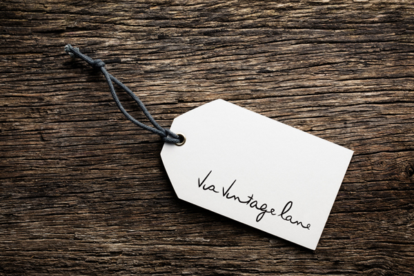
little bit plain but quite nice with the small piece of fabric over the top of the paper tag, quite vintage looking

nice with the point at the bottom, reminds me of a tie

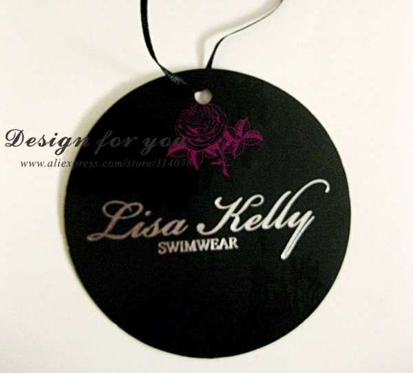
all a bit plain, the round ones are cute though

interesting shape, a bit too posh for my t-shirts

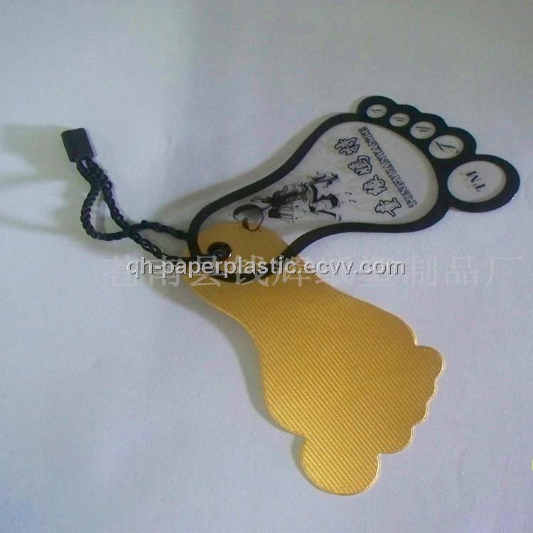
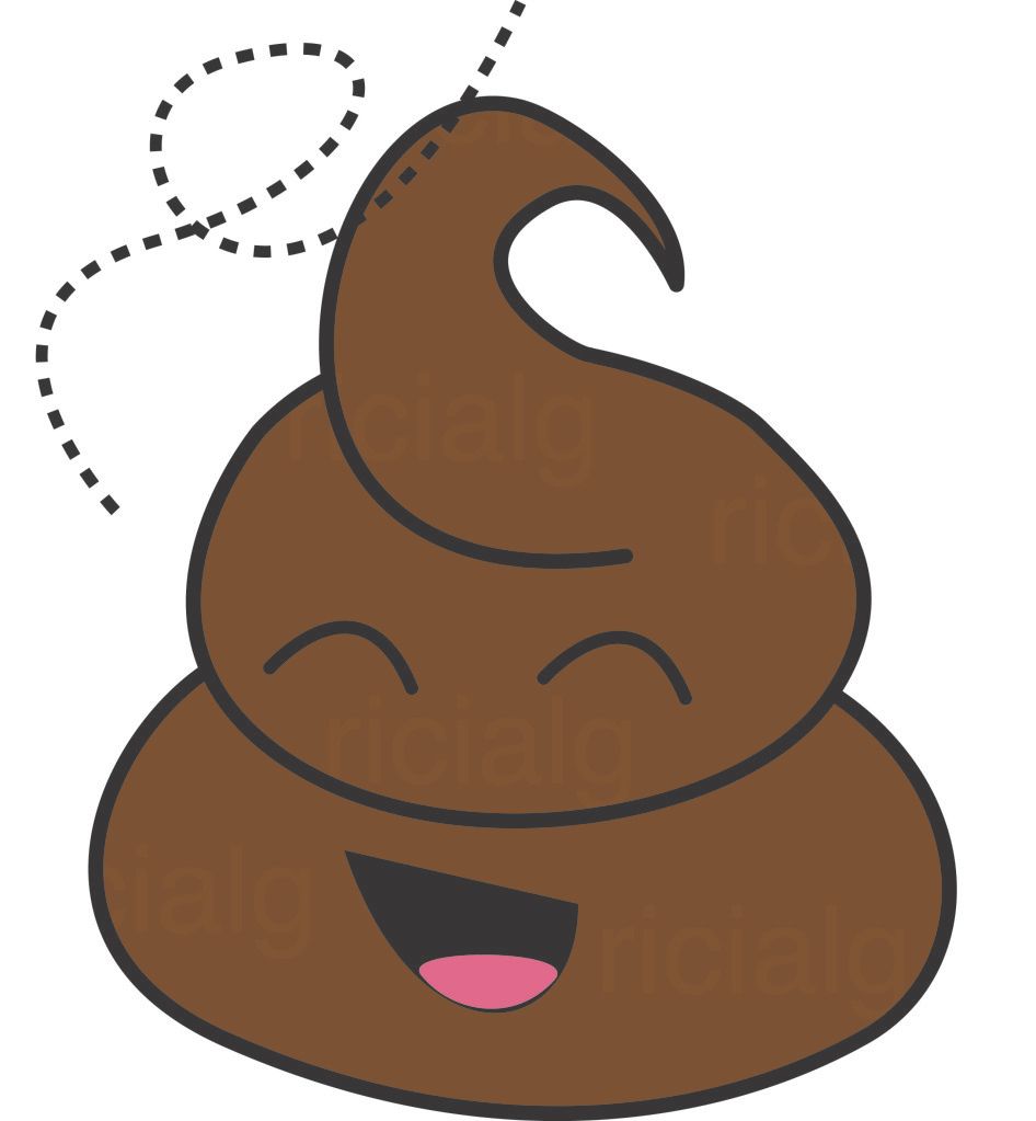
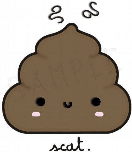
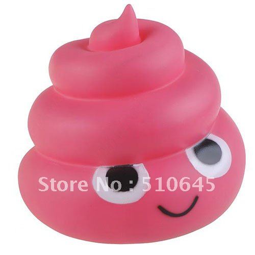
like this shape, mine could possibly be poo shaped? not sure about the clear plastic bit on top though, too expensive to make for now

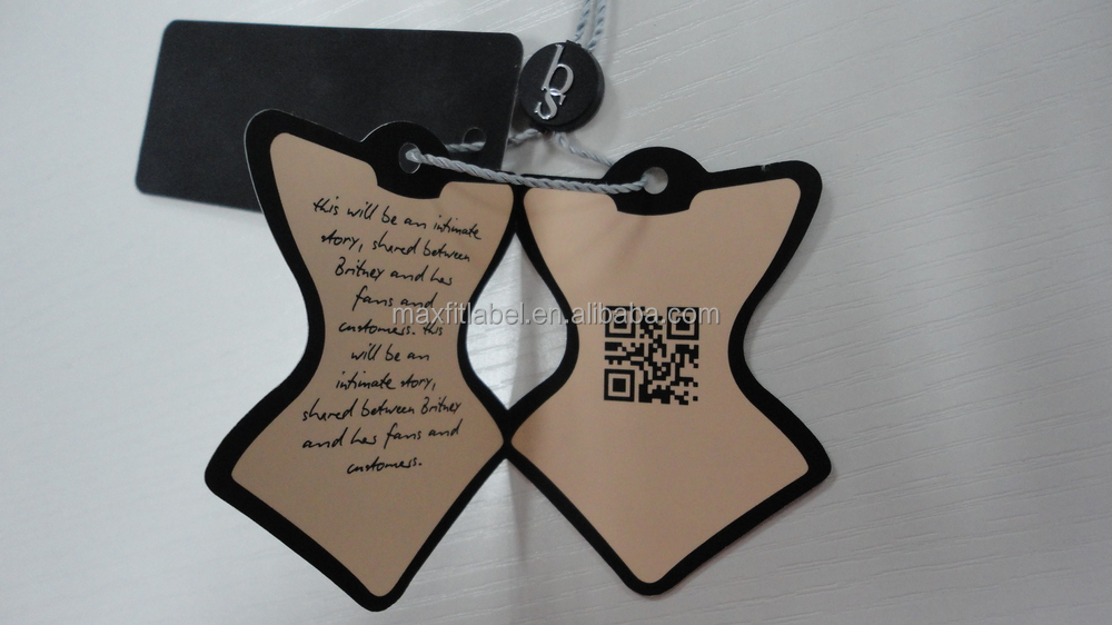
really love this but mostly because it's corset shaped! could possibly have mine t-shirt shaped?

I think the images are printed on the front, but could be cut out? quite like this, could have the poo cut out?

similar to the above labels, a good idea, my tags would have to be square though, not much room for information

like the shape, don't see this very often, simple design

very simple, like this but maybe a little on the classy side for my designs, needs to be more fun

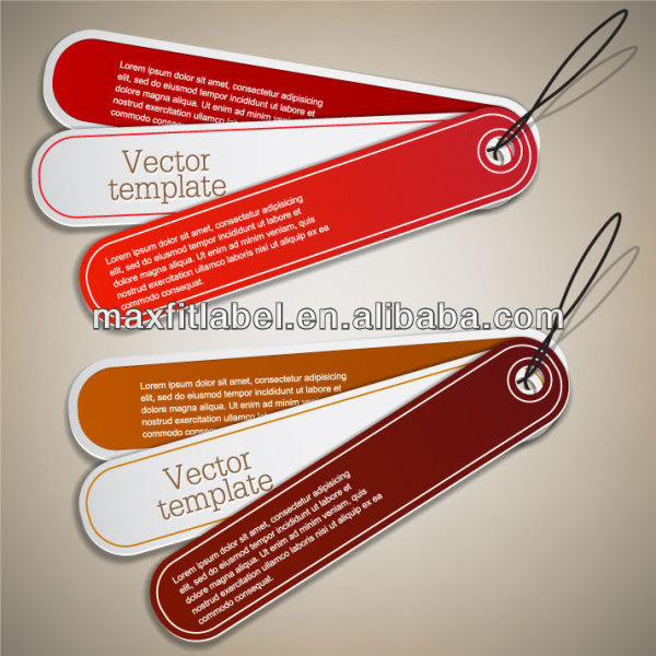
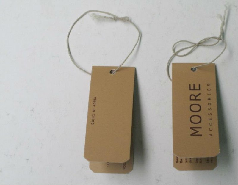
these are quite funky, like how its's doubled up and the weird shape of the front tag, plenty of room for information

doubled up so quite nice, not fun enough though

these are okay, bit boring but if each tag was a bit more funky, could definitely look better

really like how old these look, not really along my theme, but like them all the same, probably won't use them though

like the doubled up thing
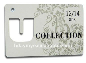
like how there's something cut out of it, maybe the "T" from T-Shit?

woo my last name! but seriously though, a bit boring

cute and round, bit boring

this is made of stone but really like the number cut out, not a lot of room for info though

very different, not seen this before, bit girly for my designs though

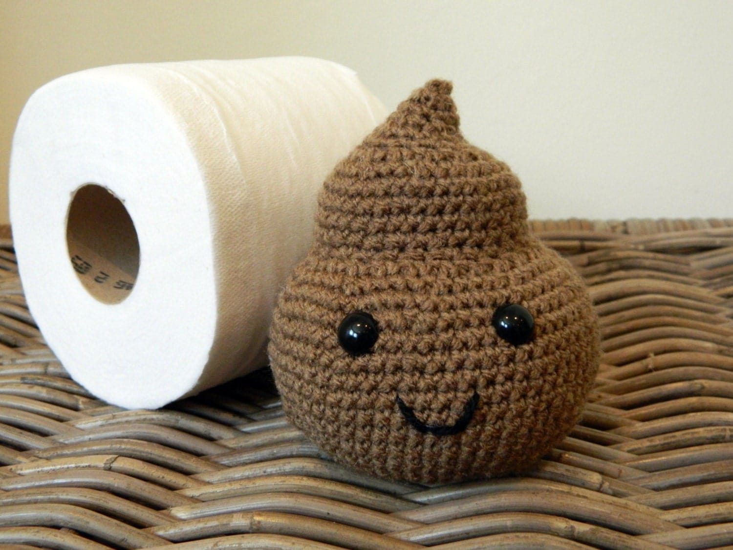
like this, could be in the shape of a poo with the info on the rectangular label behind

like how it's doubled up, but the front bit is smaller than the back

like how there is a bit cut out and you can see the text through it


T-Shirt Design: Piece of Shit initial mock up

Here is my simplest design which I created on photoshop from an idea I'd sketched on paper. It's not brilliant and I could perhaps refine it if I had more skills, but I'm not a fan of drawing on photoshop, I'd rather sketch the designs out on paper and refine them, then photograph / scan and really perfect them in photoshop. But since none of my sketches are refined yet (I haven't decided what medium to use...acrylic, sharpie, watercolour etc??) I'm having to use photoshop to get a rough idea of what my designs will look like.

I saved the above file and placed it into my illustrator document where I copied it across several t-shirt colours. I think it's quite effective and I do like it, however I'd like to see what some other designs would look like in the same style, and also what it would look like if the design was hand drawn.


It was suggested at college that I sew on my designs to create a more 3D effect with my t-shirts. I think this is a great idea but is going to be very time consuming, however I'm definitely going to give it a shot! It would also be harder with the more complex designs where more fabric would be needed, so I'll probably start off with this design.


T-Shirt Design: Shaping the Shits

The basic shape I had in mind for the Shits is a bit boring, so I'm going to explore some shit shapes and see where that gets me!

Here's some secondary research (I'll not be doing any primary research for this...ew)
There are some pretty crap designs out there...pardon the pun
But there are also some pretty cool and cute ones.

these images have given me a few ideas of the kinds of shapes and faces that my shits can have!

T-Shirt Design: Branching out?

could branch out into cushions, key rings, bags, mugs, cuddly toys etc!

T-Shirt Design: Adding colour to my designs

Obviously I don't want just black and white t-shirts with my designs on, so I made two concept sheets with the basic colours on, one with the brand name horizontal and the other vertical. The concept sheets show plain black t shirts with the coloured brand name, coloured t-shirts with a white brand name, black t-shirts with black brand name but with a coloured box and coloured t-shirts with coloured brand names surrounded by a white box.

Horizontal:

Vertical:

I tried these designs with alternate black and white colours but I decided on the ones that I ultimately thought looked best overall. Below are some screenshots to give you an idea of what the designs would look like with the alternate colour.

I preferred these with the white text as they just seem to look brighter.

This reminds me of something but I can't put my finger on what it is. I prefer the right hand design as the yellow looks like a stencil for the text. 

This works well with both colours to be honest, and it's very simple as it's just one colour on a t-shirt.

I think this works better with the white as it's brighter and stands out more. The white makes the text look sharper in my opinion.