Today we made a mock up sheet of our designs so far. I was playing about with fonts, which ones I liked and worked with the layout I wanted.
5 short listed fonts:
I extended the line of the 't' to see which worked how I'd imagined. A lot of the letters didn't line up, despite being the same font and size, so I would have to spend time rubbing out bits of the letters to make them line up if I were to choose one of those fonts.

These are the two fonts I like best. Obviously the first one doesn't have the line through it like I'd wanted, however I do really like it because of the way the letters connect, which is what I was going for with the linking of the letters anyway. The second font is nice but I think perhaps a little too fancy and the letters don't connect the way I'd like. I do like how the top of the S connects to the line of the T though, which is why I chose this font over the others.

Decided I like this one the best, it's more funky, modern and represents my brand image well.
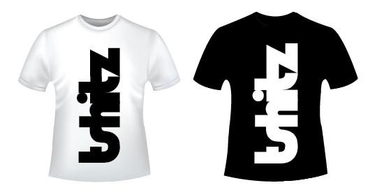
I'm liking it white on a black background as well.
I'm liking it white on a black background as well.

Quick mock up of the brand names on black and white t-shirts, both horizontally and vertically, looking at the placement of the name. I like it big and vertical, think this works well, especially with the contrast of the black on white / white on black.
Maybe have the brand name across the back of the t-shirts with the designs on the front?
Not really feeling this design to be honest, big boring and small, when I want my t-shirts to have impact, to provoke a reaction. Also the corners are a bit pointy so maybe round those later. I like the colour contrast though, just not the placement.

Don't really like the brand name as a little image at the bottom on the t shirt, maybe put it there when the designs are on the front? very plain with nothing on the front though

Not sure whether I like the box around these ones as much now... to round the corners is my next job!

Didn't actually have any well drawn designs, they're all still sketches at the moment, so I quickly drew up some rough copies on photoshop (they're really bad...it honestly took me 2 mins) but you get the idea...? This is the simplest design. I'm not sure about the design on a black t shirt because I don't really like the white outline...hmm


This is without the white outline, but I actually prefer it with the white outline compared to without any outline at all. Maybe it'll work better with a different design, I will have to try this out.

No comments:
Post a Comment