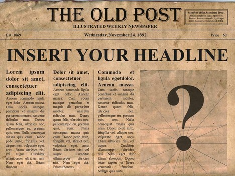
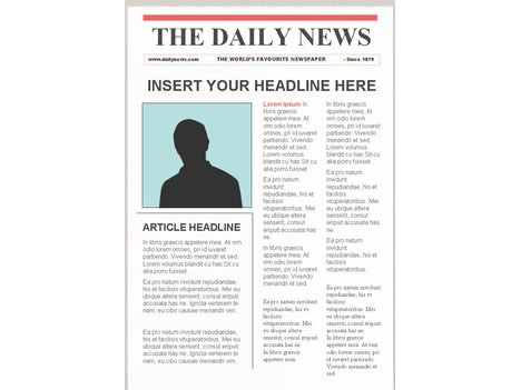
New Project Alert! Basically I have to design the front page of a newspaper, writing the articles and sourcing the pictures myself. The articles will be based on college life, along with the general theme of the newspaper. I think I'm going to keep it quite modern rather than give it an older feel (like 3rd image)
Going to be using adobe illustrator, this should be interesting as I've not used it over the summer, so now to find out what I can remember about using it! Anyway, here's a bit of research to get me started...some newspaper templates, mostly simple designs, quite bland and boring, so I want to spice mine newspaper design up!

^ Quite a few articles on this one and not too many pictures, could potentially put readers, especially new ones, off reading the cover. Mine needs to be quite eye catching! This has boring fonts and boring pictures and a very plain layout...
^ Again, rather boring, would need a good font and eye catching title to grab the readers attention, maybe another picture or two as well

^ This one is very obviously themed, in an old fashioned style. I do really like the style but I feel like you have to be quite specific with details to achieve this effect, so I'm probably going to stick to a modern theme running through my newspaper

^ This one is more like what I want, it has a lot more detail than the others I've looked at, more pictures, and just generally catches the eye more, possibly because of the bright red picture boxes...But overall its a good design, the titles stand out from the text and there's plenty to look at. The font at the very top is also interesting & different and shows a possible theme for the newspaper, although the rest of the text font is a bit...meh!

No comments:
Post a Comment