New project - how exciting! We have to each design a poster (or even a series of posters) for the Construction Dept at college focusing on health and safety in their workplace. It'd probably be a good idea to keep my poster designs funny, as this will positively reinforce the health and safety points into the minds of the workers. This post is basically going to be loads of research into the various types of funny posters that are currently out there. This will hopefully give me an insight into what kind of thing to design, and also help me find the right balance between being informative and funny with the content of my designs. I will be using photoshop and illustrator for this project, however I might incorporate some illustration in my designs as well.

^
-Contains character from the Simpsons (Homer), renowned for being funny, clumsy and basically an idiot
-Quite simple design
-Gets straight to the point
-Images of the PPE that you should be using to prevent injury
-Lighthearted images displaying pain
-Simple communication of the point of the poster
^
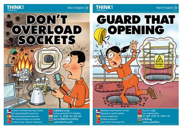
-More complex imagery
-Simple and effective text, gets straight to the point
-Images show what problems there could be
-Shows how to combat problems safely
-Multi lingual
-Cartoon imagery
^
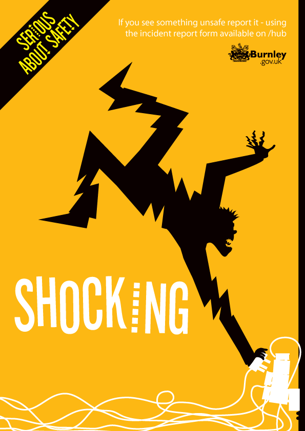
-Comical image
-Simple
-Bright colour grabs attention
-Only three colours, all work well together, make each other stand out
-Obvious what it's displaying
-Small text (top right) to explain the image further
^
-Largely same as above
-3 colours
-Stands out
-Simple
-Effective, gets point across easily
^
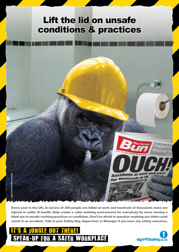
-Gorilla character
-Random and bizarre
-Quite a lot of detail
-Realistic type image (obviously not a gorilla in a hard hat, but it's not a cartoon!)
-Yellow and black colours, often associated with health and safety / danger
-Pun / joke "It's a jungle out there" referring to the gorilla
^
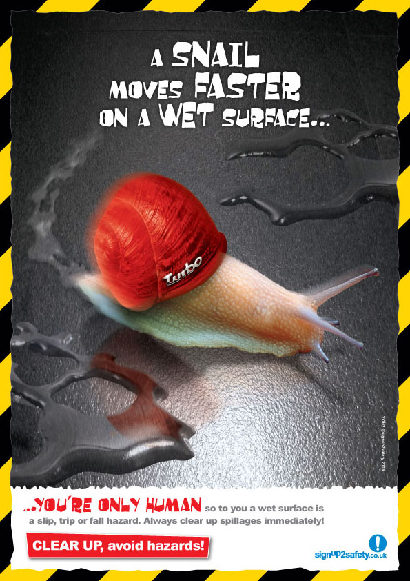
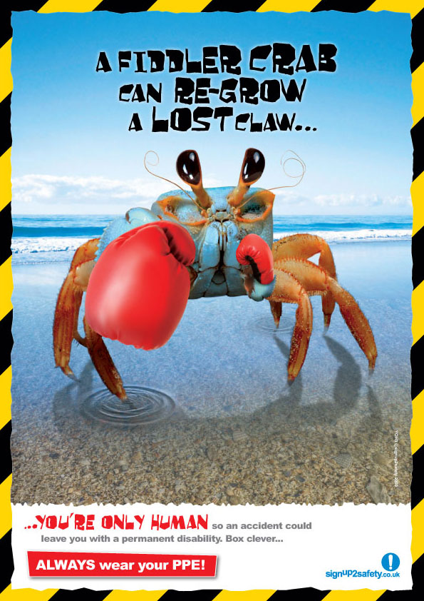
-Yellow and black colours
-Random
-Comparing animals to people "You're only human"
-Bright and eye catching
-Detailed & fairly realistic images
-Maybe a bit complex? What it is insn't immediately obvious
^
-Random
-Yellow and black
-Fairly realistic image in bizarre situation
-Comparisons between humans and animals
^
-Random
-Plenty of info at the bottom
-Yellow and black
^
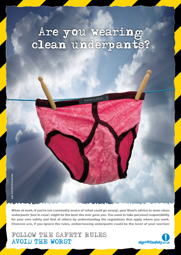
-Random
-Nothing to do with construction
-Funny
-Simple style
-Few colours so not to confuse the eye
-Colours stand out from each other
-Simple communication, not much text, however not informative
-Cartoon, childlike illustration
^
-Simpsons reference again (Maggie, Bart and Milhouse), cartoon
-Simple communication, not much text but gets to the point
-Showing an accident in the background
-Showing safety equipment
^
-yellow and black
-pun / joke
-funny picture, quite random
-realistic image
^
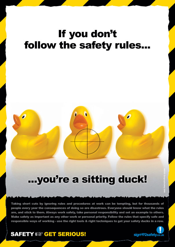
-yellow and black
-random...ducks!
-pun / joke
-bright, eye catching
-realistic image
^
-simple, quite plain design
-however design is well thought out
-small text at the bottom, depending on how big the poster is, might not be easily readable
-also, maybe a little too much text for the workmen to take in at once
-messages need to be clear and snappy, so the workmen don't lose interest
^
- simple layout
- not too much going on
- maybe a little bit plain / boring
- colours stand out from each other
- simple colour scheme
- related to construction and health & safety
- clear and concise message
- quite a forceful message as well
^
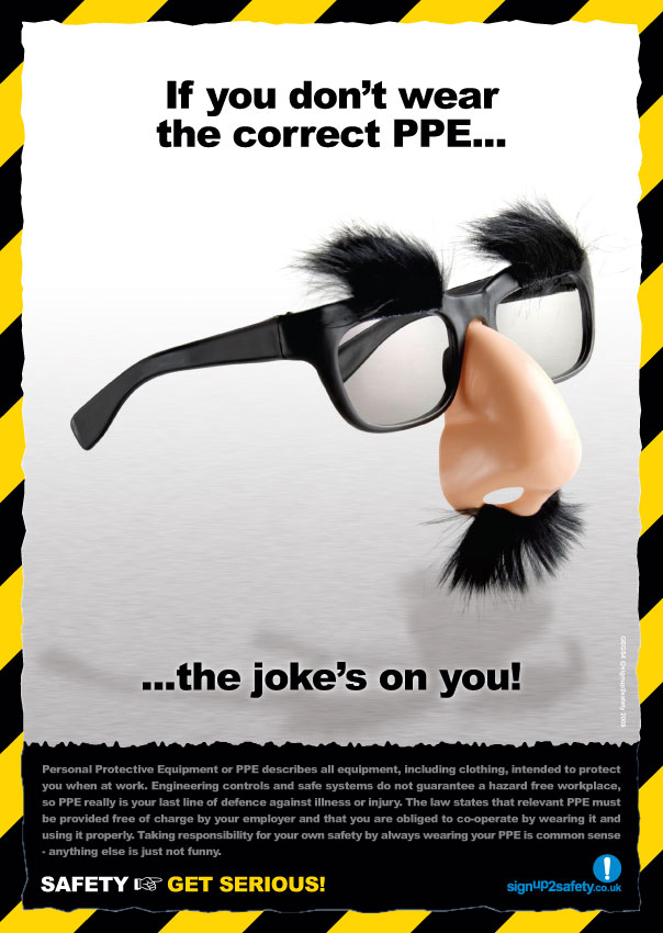
-funny
- movie reference
- bright and eye catching
- colours stand out
- not related to construction in any way
^
- funny
- Simple layout, not too much going on
- colours stand out from each other
- simple colour scheme
- eye catching and bright
- hasn't really got anything to do with construction
^
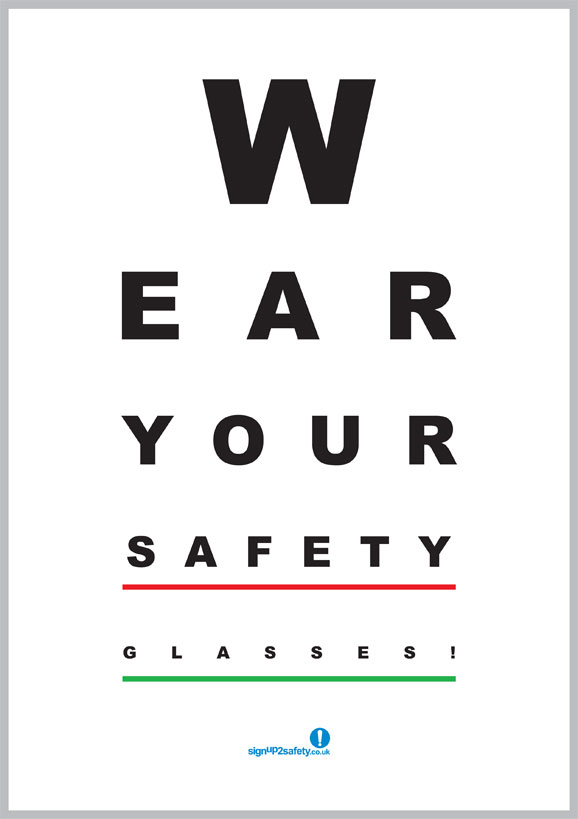
- humorous
- easy to read, if I made a sign like this it could positively reinforce the health and safety messages I'm trying to display
- no images, so that's possibly something to add
^
- funny!
- not so much a health and safety poster, but an entertaining meme nonetheless
- perhaps not make my poster like this...in case the construction workers decide to possibly copy the images and end up doing something stupid /:
^
- funny
- simple design and layout
- easy to read font
- few colours, they each stand out from each other
- simple pictures
- relative to construction






No comments:
Post a Comment