Some more research on newspapers, a little more targeted and specific...

^ This one is black and red themed, also it's quite modern in style, but keeps itself very simple, so not to confuse the reader. There are a few pictures and it's quite clear which parts are titles and which are the articles / more details about the articles. This is an online newspaper so not quite the same as a newspaper that you can physically hold, obviously the colours are probabaly brighter and the layout different because you can just click on the links to get to the articles.
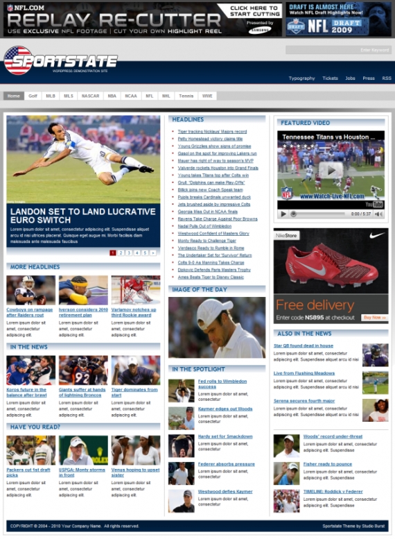
^ This sporty newspaper (online...again) has plenty of images, titles and small descriptions to show what the articles are about. The colours grab the reader's attention and draw the eye to the various articles on display

^ This is quite a simple yet effective newspaper front page. The main headline really grabs the reader's attention as it's so punchy and in your face, leading you to want to read on to the rest of the article. There's only really one article on the front of this newspaper, along with a few images, the headline, some sub-headlines, newpaper title, date, price and a small advert along the bottom. I like how bold the healines / sub-headlines are, although the fonts are quite plain. The bright background of the newspaper title 'The Sun' draws attention to specifically which newspaper it is, so maybe this is something to consider with my newspaper design..!
No comments:
Post a Comment