Wednesday, 17 September 2014

Painting Chloe... :)


So I painted Chloe...only her face! And neck and shoulders. In lesson I got a tad bored of my awful sculpture that started off as some kind of face but has turned into a weird I don't even know what! Oh and to top it off I found out that the one piece of artwork that I really liked by artist Frank Auerbach...ISN'T BY FRANK AUERBACH!!!! Argh! So my like of Auerbach's work is based on a lie :( But yeah I do still like his work...it's just a shame that the piece of work I really liked is someone's interpretation of his work; their work in the style of his, so to speak. So to re-inspire me, Jon showed me some artists that paint the human body...physically paint on skin! And there work is amazing!!! So, obviously I had to try it for myself!

Chloe willingly volunteered and I painted her first with white emulsion paint- looking back, not such a great idea, but I'll get to that later! The paint cracked around Chloe's eyes and mouth when she smiled, despite her trying to keep a straight face! But I actually really like the effect it created, like cracks in the emotionless mask I was painting onto her face...wow, deep!


So this lovely picture is of Chloe's face when I thought I was done, but I ended up adding some more yellow tones after this photo was taken! I was trying to highlight and shade with the two colours...sort of. I tried to base it on the artist Alexa Meade: http://alexameade.com/ I cannot get over her work...It's AWESOME!!


I personally think the side view pictures look the best as they show the definition of half the face and look kinda spooky... eerie like she's wearing a mask!

Health and Safety posters research

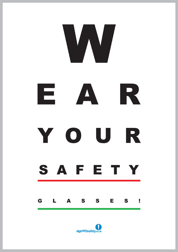
New project - how exciting! We have to each design a poster (or even a series of posters) for the Construction Dept at college focusing on health and safety in their workplace. It'd probably be a good idea to keep my poster designs funny, as this will positively reinforce the health and safety points into the minds of the workers. This post is basically going to be loads of research into the various types of funny posters that are currently out there. This will hopefully give me an insight into what kind of thing to design, and also help me find the right balance between being informative and funny with the content of my designs. I will be using photoshop and illustrator for this project, however I might incorporate some illustration in my designs as well.
-Contains character from the Simpsons (Homer), renowned for being funny, clumsy and basically an idiot
-Quite simple design
-Gets straight to the point
-Images of the PPE that you should be using to prevent injury
-Lighthearted images displaying pain
-Simple communication of the point of the poster

^
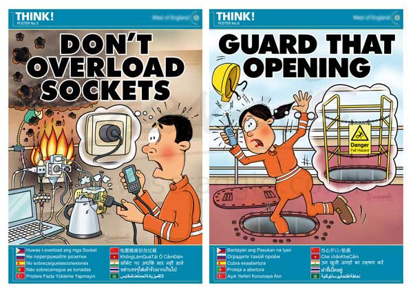
-More complex imagery
-Simple and effective text, gets straight to the point
-Images show what problems there could be
-Shows how to combat problems safely
-Multi lingual
-Cartoon imagery

^
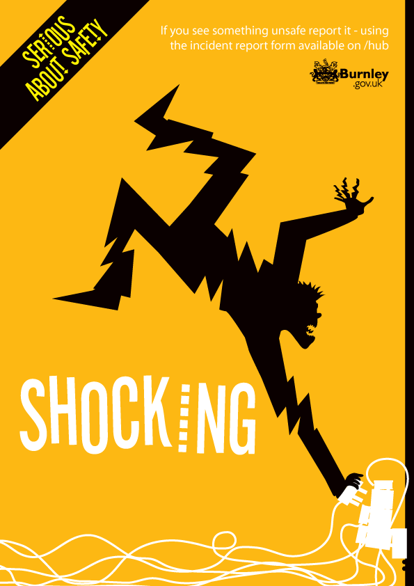
-Comical image
-Simple
-Bright colour grabs attention
-Only three colours, all work well together, make each other stand out
-Obvious what it's displaying
-Small text (top right) to explain the image further

^
-Largely same as above
-3 colours
-Stands out
-Simple
-Effective, gets point across easily

^
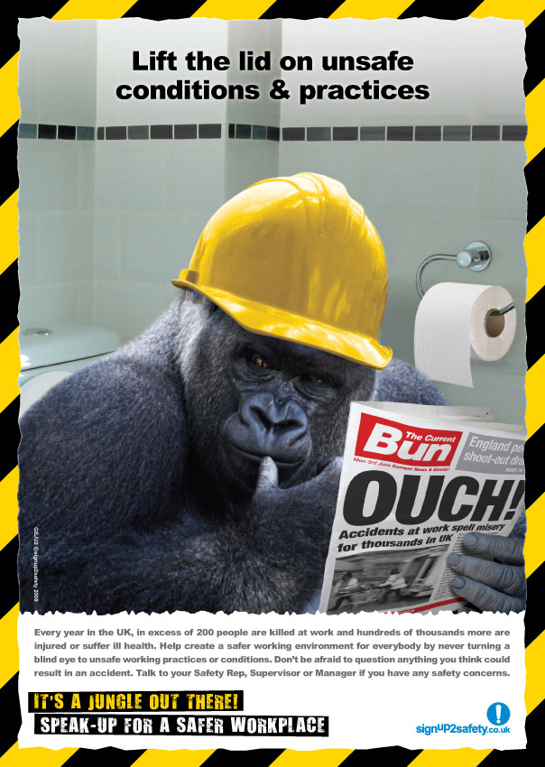
-Gorilla character
-Random and bizarre
-Quite a lot of detail
-Realistic type image (obviously not a gorilla in a hard hat, but it's not a cartoon!)
-Yellow and black colours, often associated with health and safety / danger
-Pun / joke "It's a jungle out there" referring to the gorilla

^
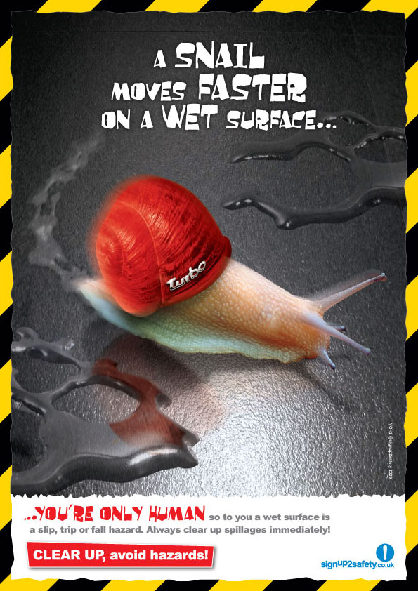
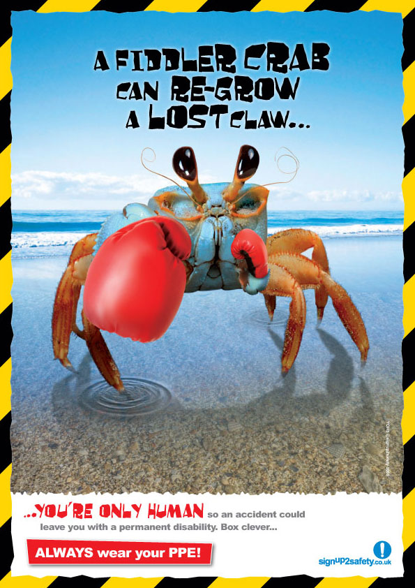
-Yellow and black colours
-Random
-Comparing animals to people "You're only human"
-Bright and eye catching
-Detailed & fairly realistic images
-Maybe a bit complex? What it is insn't immediately obvious

^
-Random
-Yellow and black
-Fairly realistic image in bizarre situation
-Comparisons between humans and animals

^
-Random
-Plenty of info at the bottom
-Yellow and black


^
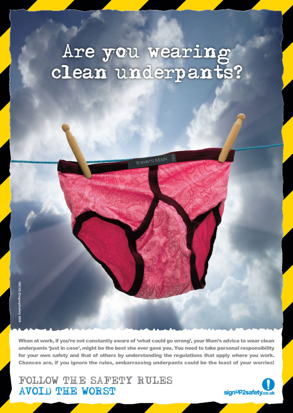
-Random
-Nothing to do with construction
-Funny
-Simple style
-Few colours so not to confuse the eye
-Colours stand out from each other
-Simple communication, not much text, however not informative
-Cartoon, childlike illustration
^
-Simpsons reference again (Maggie, Bart and Milhouse), cartoon
-Simple communication, not much text but gets to the point
-Showing an accident in the background
-Showing safety equipment

^
-yellow and black
-pun / joke
-funny picture, quite random
-realistic image

^
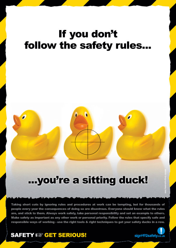
-yellow and black
-random...ducks!
-pun / joke
-bright, eye catching
-realistic image

^
-simple, quite plain design
-however design is well thought out
-small text at the bottom, depending on how big the poster is, might not be easily readable
-also, maybe a little too much text for the workmen to take in at once
-messages need to be clear and snappy, so the workmen don't lose interest

^
- simple layout
- not too much going on
- maybe a little bit plain / boring
- colours stand out from each other
- simple colour scheme
- related to construction and health & safety
- clear and concise message
- quite a forceful message as well

^
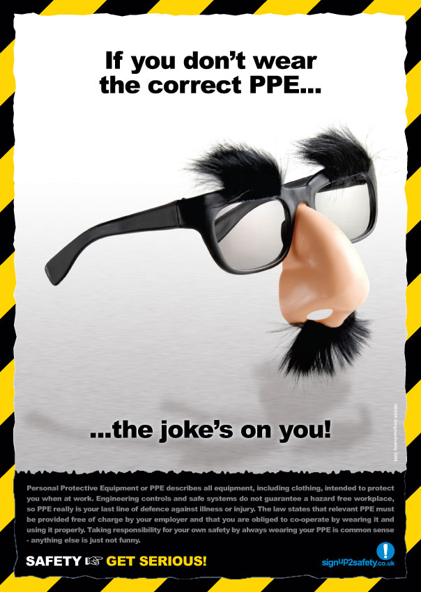
-funny
- movie reference
- bright and eye catching
- colours stand out
- not related to construction in any way

^
- funny
- Simple layout, not too much going on
- colours stand out from each other
- simple colour scheme
- eye catching and bright
- hasn't really got anything to do with construction

^
- humorous
- easy to read, if I made a sign like this it could positively reinforce the health and safety messages I'm trying to display
- no images, so that's possibly something to add

^
- funny!
- not so much a health and safety poster, but an entertaining meme nonetheless
- perhaps not make my poster like this...in case the construction workers decide to possibly copy the images and end up doing something stupid /:

^
- funny
- simple design and layout
- easy to read font
- few colours, they each stand out from each other
- simple pictures
- relative to construction

Tuesday, 16 September 2014

Metamorphosis at The National Gallery - Abstraction

In 3D and sculpture I am now looking into metamorphosis as part of my course.
Having looked at The National Gallery website and the exhibition about metamorphosis I have found out about the poems and artwork that base themselves on metamorphosis...http://www.nationalgallery.org.uk/metamorphosis-titian-2012

Basically, there's an exhibition all about these poems with artwork, both traditional and contemporary. The contemporary works give a modern twist on the ancient stories, whereas the traditional work shows the poems in a more literal way.

The three paintings depict stories from Ovid's epic poem ‘Metamorphoses’. The poems are as follows:

Diana of Actaeon http://www.nationalgallery.org.uk/paintings/titian-diana-and-actaeon

The Death of Actaeon http://www.nationalgallery.org.uk/paintings/titian-the-death-of-actaeon

Diana and Callisto http://www.nationalgallery.org.uk/paintings/titian-diana-and-callisto

Chris Ofili, Conrad Shawcross and Mark Wallinger

Three contemporary artists, as above, they each took the poems in their own way and created modern artwork based upon the poems, including costumes and set designs for three new ballets also based upon these poems at The Royal Opera House.

"Top British choreographers, dancers and composers have collaborated with the artists to create an evening of three new works, performed at The Royal Opera House by The Royal Ballet in July 2012.
Watch excerpts of the ballets, recorded live on 16 July."

Details about the poems:
Roman poet Ovid’s (43 BC–17 AD) 15 book poem was written in Latin and features the story of Diana, which inspired Titian's three great paintings.
Based on the theme of 'change' ('Metamorphoses' means 'transformations' in Greek), these mythical tales were as renowned in Titian's day as Bible stories, and were a popular source of inspiration for many Renaissance artists.


^ This helps a lot to understand the first two poems! A more modern representation to explain the poems in a simplistic and dramatized way.


^ This explains how The Royal Ballet company came up with this new interpretation and transformed it into a ballet performance. It explains how the robot / sculpture represents Diana

Specific research into The Sun Newspaper

I am going to research into The Sun newspaper to see whether they have a specific layout when it comes to their front page... 
^ This issue has the name of the newspaper at the top along with an advert, taking up about one third of the page space. The single headline on the front takes up the other two thirds of space and is the main focus of the newspaper. There is a large picture as the background for the article and a small text box with extra details, probably with "Read the full story on page..." at the bottom. There is a sub headline underneath the main headline that explains slightly more about the article, with information you could not gather from the main headline.


Monday, 15 September 2014

Newspapers to base my design on

Loosely basing my newspaper design on this front cover... if I ever get round to finishing it!

Sunday, 14 September 2014

More targeted research into newspapers

Some more research on newspapers, a little more targeted and specific...


^ This one is black and red themed, also it's quite modern in style, but keeps itself very simple, so not to confuse the reader. There are a few pictures and it's quite clear which parts are titles and which are the articles / more details about the articles. This is an online newspaper so not quite the same as a newspaper that you can physically hold, obviously the colours are probabaly brighter and the layout different because you can just click on the links to get to the articles.


^ This sporty newspaper (online...again) has plenty of images, titles and small descriptions to show what the articles are about. The colours grab the reader's attention and draw the eye to the various articles on display


^ This is quite a simple yet effective newspaper front page. The main headline really grabs the reader's attention as it's so punchy and in your face, leading you to want to read on to the rest of the article. There's only really one article on the front of this newspaper, along with a few images, the headline, some sub-headlines, newpaper title, date, price and a small advert along the bottom. I like how bold the healines / sub-headlines are, although the fonts are quite plain. The bright background of the newspaper title 'The Sun' draws attention to specifically which newspaper it is, so maybe this is something to consider with my newspaper design..!

Newspaper Templates Research

New Project Alert! Basically I have to design the front page of a newspaper, writing the articles and sourcing the pictures myself. The articles will be based on college life, along with the general theme of the newspaper. I think I'm going to keep it quite modern rather than give it an older feel (like 3rd image)
Going to be using adobe illustrator, this should be interesting as I've not used it over the summer, so now to find out what I can remember about using it! Anyway, here's a bit of research to get me started...some newspaper templates, mostly simple designs, quite bland and boring, so I want to spice mine newspaper design up!
 
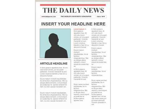
^ Quite a few articles on this one and not too many pictures, could potentially put readers, especially new ones, off reading the cover. Mine needs to be quite eye catching! This has boring fonts and boring pictures and a very plain layout...
^ Again, rather boring, would need a good font and eye catching title to grab the readers attention, maybe another picture or two as well

^ This one is very obviously themed, in an old fashioned style. I do really like the style but I feel like you have to be quite specific with details to achieve this effect, so I'm probably going to stick to a modern theme running through my newspaper

 
^ This one is more like what I want, it has a lot more detail than the others I've looked at, more pictures, and just generally catches the eye more, possibly because of the bright red picture boxes...But overall its a good design, the titles stand out from the text and there's plenty to look at. The font at the very top is also interesting & different and shows a possible theme for the newspaper, although the rest of the text font is a bit...meh!